Carpool
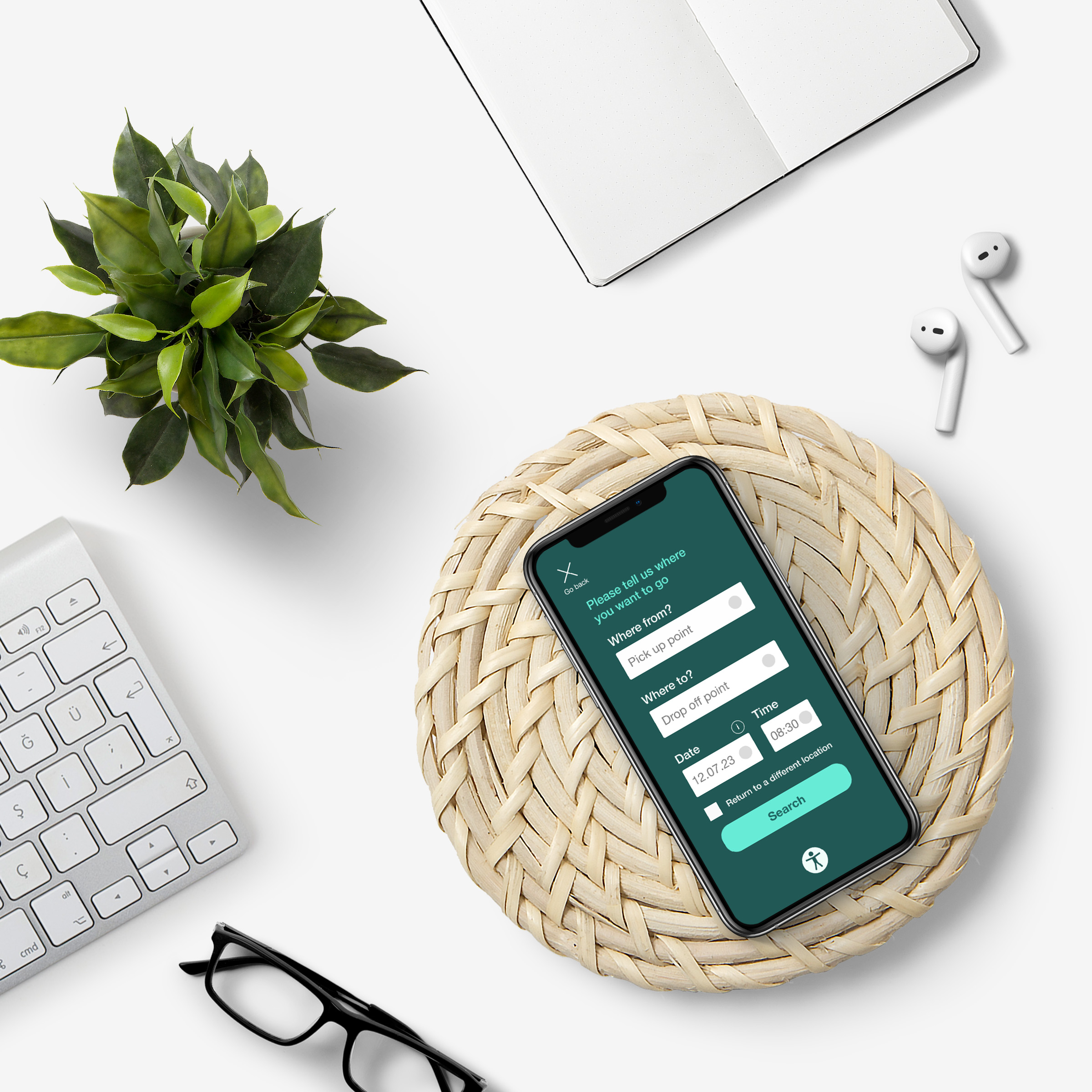
A carpooling app designed to focus on accessibility. The target users are elderly people, especially those with vision impairments. The app promotes eco-friendliness in areas with limited public transport. Our design ensures easy registration and a clear confirmation for users.
Summary
Problem
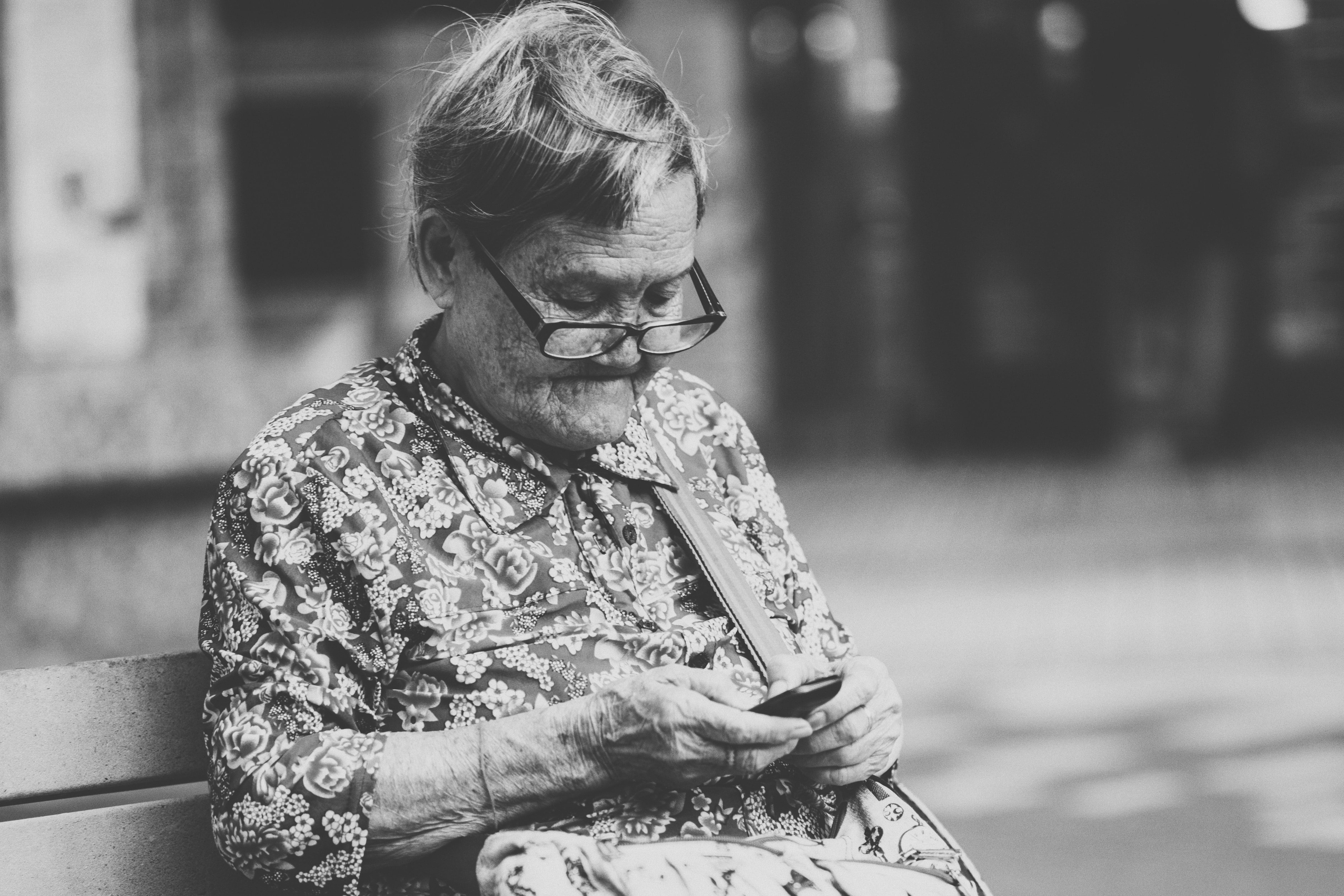
In a world increasingly reliant on technology for everyday tasks, individuals with sight limitations, particularly the elderly, often find themselves sidelined. Mainstream app designs typically don't accommodate their specific needs, making it challenging for them to use these platforms, thereby limiting their independence.
Goal
Our objective was to bridge this digital divide by designing a mobile application tailored to the needs of elderly individuals with sight limitations. The aim was not just to create an app, but to craft an inclusive experience that respects their autonomy and empowers them to navigate the digital world with confidence.
My role
As a passionate advocate for accessibility in design, I found this project deeply rewarding. Within our collaborative team environment, we all participated in creating wireframes and UX flow. My specific contributions were in crating wireframes, conducting user testing and creating user flows, ensuring the app's design aligns with accessibility standards and responds to real user needs.


Challenge

The primary challenge was balancing simplicity and functionality while strictly adhering to accessibility guidelines. Designing for users with sight limitations meant rethinking traditional design elements, from color palettes and typography to navigation and feedback mechanisms. Furthermore, we had to ensure that these elements not only met guidelines but were also intuitively usable for our target demographic.
Process
For this project, we chose the design thinking methodology because of its user-centered approach, which is crucial when designing for accessibility. This process allowed us to deeply understand the users' needs, iterate quickly, and continually refine our design based on real-world feedback, ensuring the app was truly tailored to users with sight limitations.


Results
The project culminated in the creation of an accessible sign-up and log-in page, marking a significant step towards digital inclusivity. Iterative testing led to design improvements, such as enhanced contrast, legible fonts, and user-friendly instructions. This process ensured our final product wasn't just compliant with standards but genuinely user-centric.


Lessons learned
Despite being early in my UX career when tackling this project, it underscored my commitment to accessibility in design—a principle I continually strive to improve upon. This experience taught me that user testing is invaluable, often uncovering overlooked aspects. More importantly, it reaffirmed that designing for accessibility isn't merely a regulatory checkbox but a step towards creating a more inclusive world.